
[THE CACHE] A FEW SELECTED BODIES OF WORK PRE-COLLEGE.
POWERED BY THE GARDEN VERSION 1.4 ⌂
[PRAXIS] - 2025
design 1
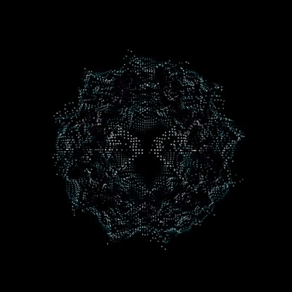
Praxis is a self-developed, three. js/tailwind-based project that I developed over this past summer. Via the app, any user can create a custom point cloud from a variety of uploadable media for completely free (currently). Next.js is the React framework; React is used for UI, and TypeScript is used for the main codebase. It’s built on the backend of (Google) Firebase’s console hosting—something that I’ll probably continue using for most web apps in the future due to ease of access/Gemini integration.
The actual system that Praxis utilizes converts uploaded files into raw pixel data, converts them into readable RGB,USES the brightness of the raw pixel data (judged as ‘Luminence’), and then transposes said data onto a transparent canvas (with luminance being the primary differentiator in figuring out the depth at which each pixel should be located). For every pixel that isn’t transparent, Praxis calculates perceived luminance (through its RGB value) vis-à-vis a grayscale, which ultimately determines how it weights the viewable colors (best seen here). Similar calculations are done ACROSS THE BOARD REGARDING FILE TYPES.
To be clear, and for the time being, all work created via praxis is CC0 and is free to use as you please. The goal with this tool was for this sort of visual to be democratized.
Full Beta Documentation for V.1 will be made available soon.
Context 2
following my recent point cloud work (Posters/Videos) using Blender’s in-engine (Cycles) geometry nodes, I wanted to create essentially a plug-and-play solution to the visuals I was creating to make them more accessible to designers; something that would bypass the geo-node setup entirely, and act as an in-web design tool (similar to the likes of Tooools, Ditherboy, etc,) for myself and others to use as they please. Praxis, as of right now, receives and translates data from PNGs, OBJ files (yes—you can import 3D geometry), and MP4s, with plans to expand this to FBXs, Blends, and GIF files in the near future. While there is a decent amount of customizability added to Praxis in its current state (point density, point size, etc.), I do still recommend something like Blenderbin—created by Marv.OS—for a Blender-based solution. That being said, if skirting 3D software for the sake of time is at all appealing, Praxis will do the trick visually.
important:
To be clear, and for the time being, all work created using praxis is CC0. The partial goal with this tool was for this sort of visual style to be democratized. Paywalling would go directly against this mentality.
feel free to send me your creations at via dm @ankasystem or @_finnarcher_!
SOFTWARE 3NEXT.JS, REACT, TYPESCRIPT, SHADCN, GENKIT, LUCIDE REACT, PHOTOSHOP, ILLUSTRATOR
ROLE 4
UI/UX DESIGNER, DEVELOPER
⣹ *25 - 1/10 - mp4 ^

[ARENIUS] - 2025
design 1
As a UI/UX Designer for Arenius, an accessible carbon accounting platform for SMEs, I co-designed the complete brand identity and user interface within the Generate Product Development program. Collaborating with a team of three other designers, I conducted extensive product research and competitor analysis to inform our design of the entire front-facing platform, from low-fidelity wireframes to high-fidelity prototypes. I specifically led the design for the user dashboard and client management pages, focusing on creating intuitive and agile user flows. I also greatly influenced the continued usage of gradients throughout containers/charts in the finished product.
(PRESS PLAY IN TOP RIGHT OF DOCUMENT)
Context 2
Arenius was built fundamentally as an affordable, intuitive sustainability platform. It acts as an SME alternative to Persefoni, Xero, and so on, balancing human-centric, accessible UI, with clear carbon metric data to ensure that firms are operating with the utmost integrity. Furthermore, it allows companies, as is stated in our Brand Book, to “stay competitive in an increasingly eco-conscious market by providing a transparent carbon accounting tool that simplifies sustainability reporting.”
SOFTWARE 3
figma, illustrator, photoshop
ROLE 4
UI/UX PLATFORM DESIGNER
⣹ *25 - 1/10 - fig 4 ^
[ankasystem portfolio] - 2025
design 1
This site is entirely created on Adobe’s portfolio platform without the use of any generative AI. The UI is custom-designed, and while this portfolio contains little to no coding implementation by me, there are several exploited ‘loopholes’ that skirt the relatively limited customizability provided. For example, “spacers” are used throughout the site to ensure mobile functionality as well as to maximize spacing control on my end. Moreover, a GIF is displayed in the background to mimic a custom, CRT-esque feed of a field (or the “cape”)—something that I’ve done across multiple sites in the past in an effort to emphasize world-building/placemaking/spaciality (I’m obsessed with this—and it’s something that I think will flourish in a world of ever-sterile interfacing [initially I believe this was influenced by Frank Ocean’s BLONDED site]). Tracking back to the UI, the menu style is heavily influenced by early, analog teletext visuals and '90s personal computers portals (I’ve been obsessed with this functional, analog, almost back-end style UI for a while now). Linux environments/monitors/managers (htop, Midnight Commander, etc) as well as GitHub terminal sites were also studied throughout the design process. Brutalistsites.com was also referenced multiple times during the duration of design research. Pseudo-borders were created around each ‘portfolio’ image to mimic traditional UI borders found in most other portfolio software (done in Photoshop—not available on Adobe Portfolio). The primary typeface used throughout is Nitti Typewriter from the foundry Bold Monday. The “ANKA” logo, in conjunction with my personal logo, was designed originally in 2022 and takes inspiration from the original AKIRA logotype. My own glyph/logoform is in slight homage to the designer Paul Nicholson, creator of the Aphex Twin identity.
Context 2
This portfolio was designed over the course of 3 months in 2025. Using Adobe Portfolio was admittedly an arduous design problem—but one that was ultimately, incredibly redeeming. Skirting technical limitations via somewhat scrappy means wasn’t the most fun time either, with the platform having limited save-state features, no ability to duplicate modals/headers/footers/etc, or, in general, not having a lot of ease-of-access bonuses guaranteed by websites such as Framer, Figma Sites, Cargo, etc. That being said, I am incredibly happy with the result. The site is undoubtedly mine, and while it could have been created on any one of those aforementioned alternatives, I almost appreciate the fact that it was curated via almost archaic means—especially in a day and age where you can create a platform effectively with a simple prompting sentence. If you have any questions about my portfolio, my reasoning behind the design, etc, feel free to reach out!
All original work is my intellectual property unless otherwise credited.
© 2025 [ANKA / FINN]. All rights reserved.
Use or reproduction without permission is prohibited.
SOFTWARE 3
ADOBE PORTFOLIO, BLENDER, PHOTOSHOP, ILLUSTRATOR
ROLE 4
Crash-out expert, UI/UX PLATFORM DESIGNER

⣹ *25 - 1/10 - .com ^
ALL RIGHTS RESERVED FINN / ANKA
*NO GENERATIVE AI WAS USED IN THE MAKING OF THIS SITE.