
[THE EARLY YEARS] A FEW SELECTED BODIES OF WORK PRE-COLLEGE.
POWERED BY THE GARDEN VERSION 1.4 ⌂
[DISTINCTIVE BRAND] - 2019-21
design 1
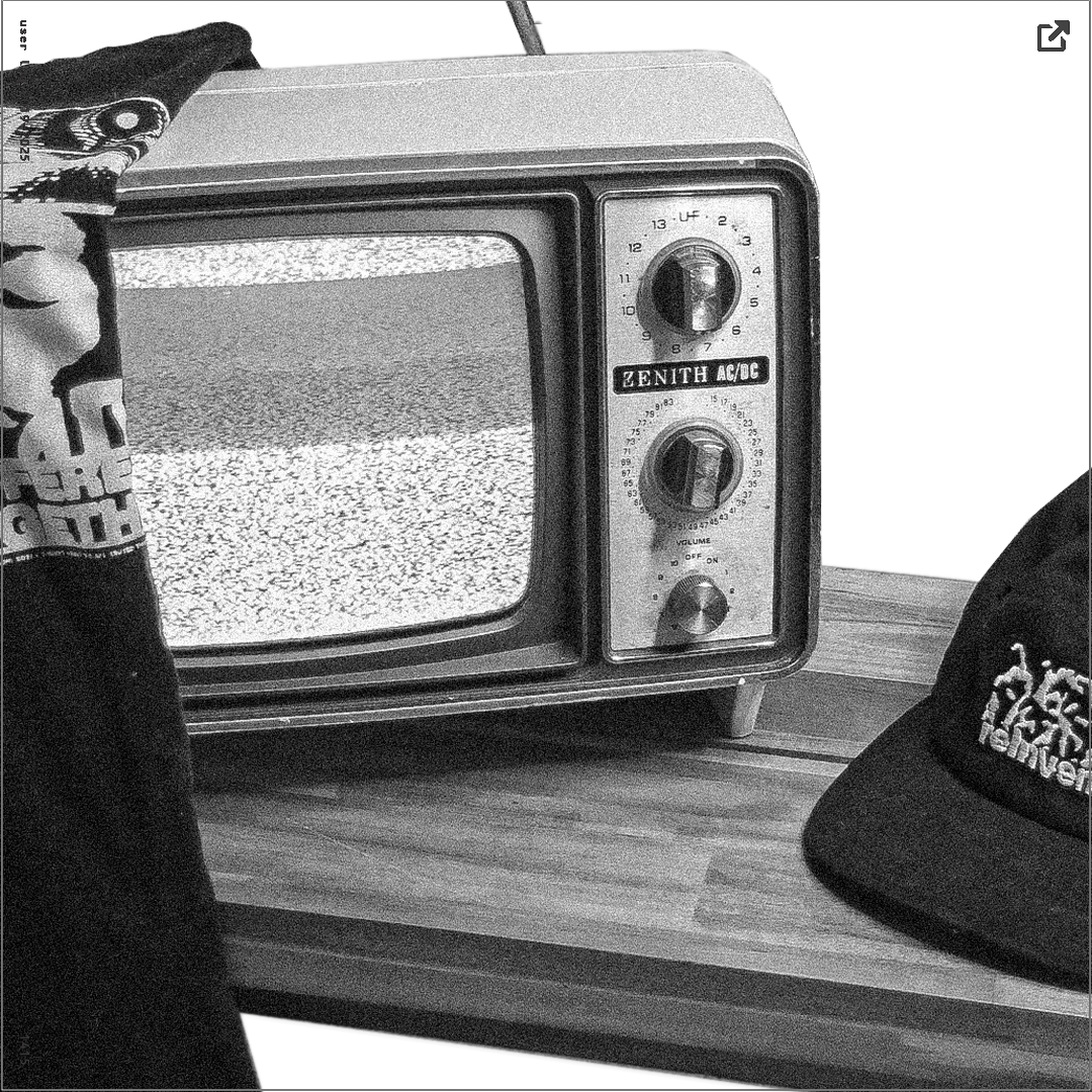
Inspired initially by the success of CRASH and PYTHIA, among others, "DISTINCTIVE" was a label I founded during my freshman year in high school. A great inspiration for this project was The Twilight Zone, as is evidenced by the repeated usage of vintage TV designs in all collections created. PYREX (Pre-off white) was also massively influential to the brand's look. Gildan was initially used for blank sourcing; however, with the Shopify move, I ended up migrating to Rue Porter (whom I still use to source products from for various projects today).
Context 2
All campaigns released during the allocated drop weeks (3) had 40% of their profit margin donated to relevant charities (Direct Relief, LRC). The first collection was hosted on a site called Teespring, while all following had dedicated Shopify storefronts. All items were either cut & sew or POD.
SOFTWARE 3
bLENDER, pHOTOSHOP, pREMIERE, CLo3d, shopify (+apps/email), Printful, shapeways
ROLE 4
graphic designer, clothing designer, brand owner, Photographer, brand manager, sM manager saas/crm, etc.
⣻ *19-21 - 1/10 - pdf ^

[EO] - 2023
design 1
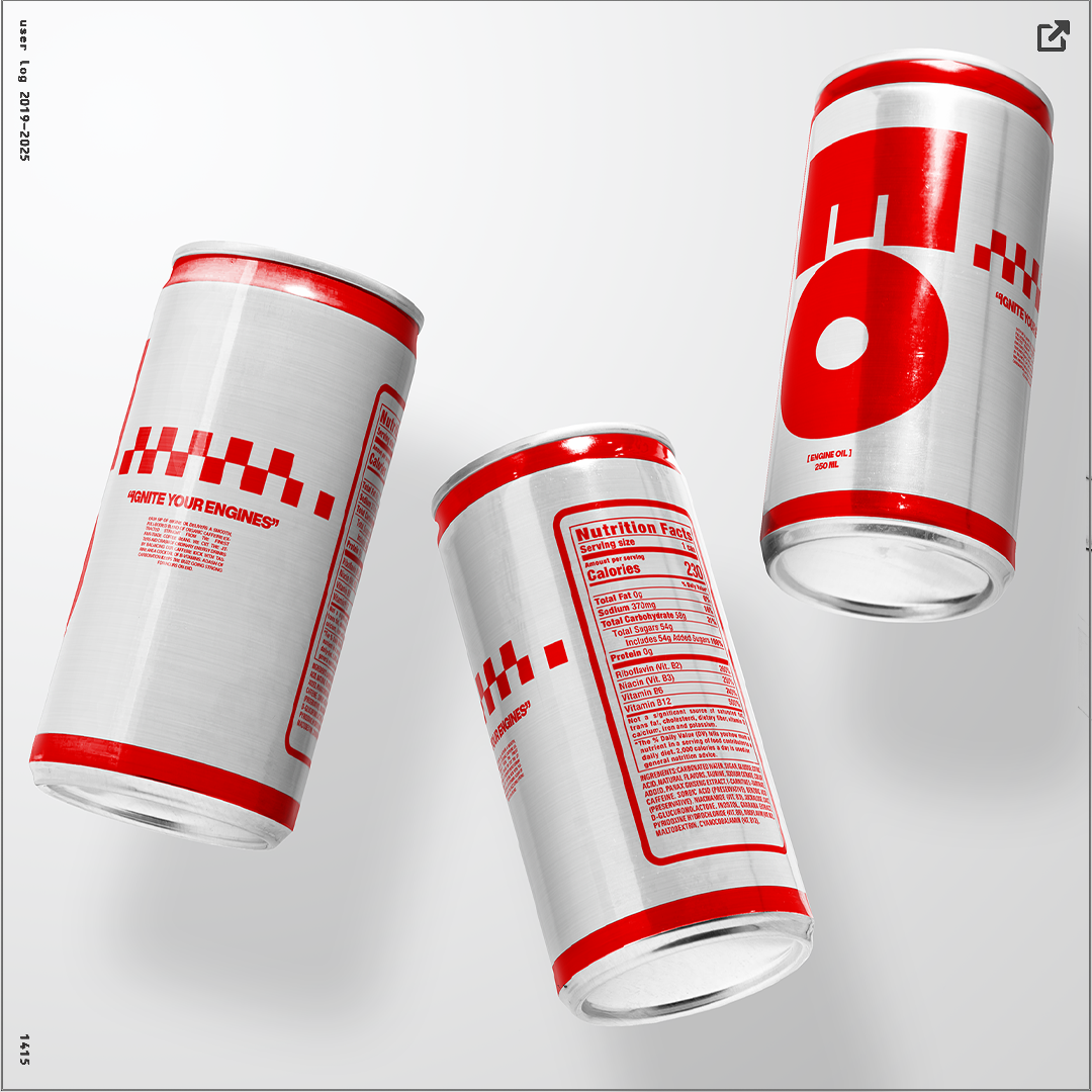
I approached this design with the intent of creating something that was both striking visually and that embodied, subtly, 60s racing culture (think like Ford v. Ferrari). This is evidenced by the red checkered details and the overall red/white combo. Moreover, I believe that the EO design in itself could be used as a brand mascot, if this were to become an actual product/brand.
Context 2
Made for a concept Energy drink company 'engine oil' who would theoretically sell under the Eo emblem.
SOFTWARE 3
bLENDER, PHOTOSHOP, Illustrator
ROLE 4
3D-aRTIST, Graphic designer
⣻ *23 - 1/10 - jpeg ^
[IB PROGRAM REVAMP]
design 1
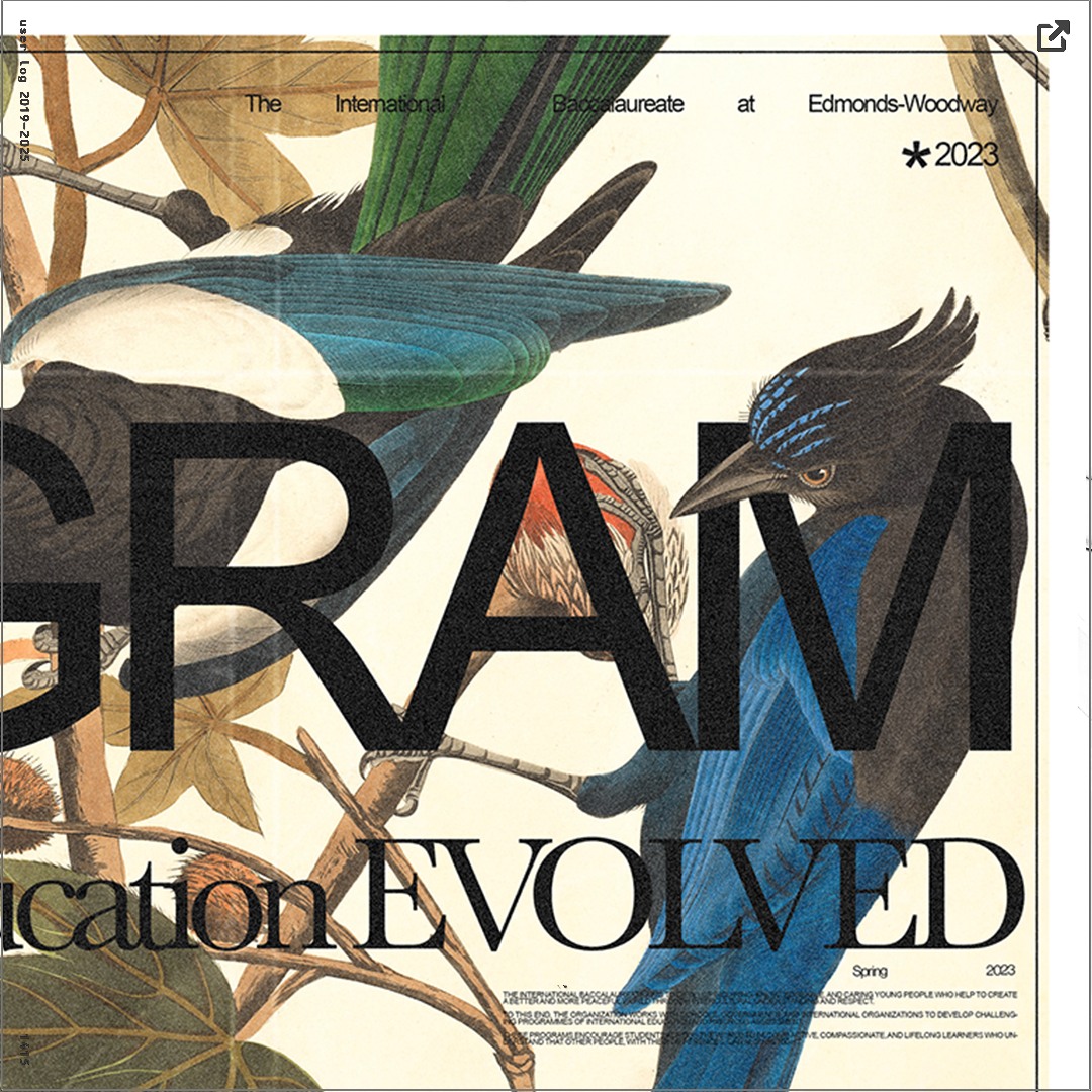
The work for the rebrand largely took inspiration from the New Yorker magazine covers. All design work is by me; however, the VARIOUS BACKGROUNDS ARE biological illustrations derived mostly from the Boston Public Library. The fonts used are Helvetica (a condensed version made in Photoshop) and Baskerville. Most marketing work also incorporates shades of green to match the new IB logo (designed by me as well) and the aforementioned nature depictions.
Context 2
I developed, in my senior year, in collaboration with my IB coordinator, a design board that would produce marketing materials and merchandise for our IB program. My logo is the current face of all IB-related marketing and promotional materials produced by the school. The work below represents some of my main contributions to the board with regard to the Spring marketing campaign
SOFTWARE 3
bLENDER, pHOTOSHOP, PREMIERE.
ROLE 4
3D-aRTIST, witness
⣻ *23 - 1/10 - pdf ^
ALL RIGHTS RESERVED FINN / ANKA
*NO GENERATIVE AI WAS USED IN THE MAKING OF THIS SITE.